How our carbon footprints scale with wealth
6 min read
Jul 28, 2022

This week, following a similar vein to last week, will also be about personal carbon footprints. So if you’re sick of personal carbon footprints at this point, well, I’ve got a week or two more left on this subject! 😊
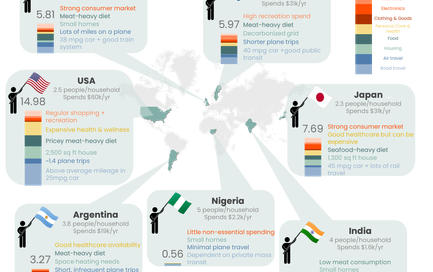
As I’ve mentioned before, people with higher incomes have a much larger impact on the environment. Rich people eat more, fly more, buy more…the list goes on. We saw this last time with the different incomes and corresponding footprints across countries.
But when you hold in-country infrastructure and emissions factors constant, how does wealth really scale personal footprint? Understanding this can help us figure out:
- What activities can people be more conscious of (for the sake of the environment) as they experience social and economic mobility?
- What are the most egregious contributions to carbon by the wealthy?
This might also provide some firmer benchmarks for me in understanding where I personally land on the carbon footprint spectrum compared to my income peers (which, by the way, has dramatically shifted since I quit my investment banking job…).
I looked at three income inflection points: 1) going from poverty to middle class, 2) going from middle class to upper middle class, and 3) going from upper middle class to ultra-wealthy. I assumed:
- For a household at the poverty line, a household of 2.5 people was assumed to make & spend $22k / year, consistent with the federal guidelines. Also assumed that their main form of transport was by bus, they took no air travel, they lived in a house under 1,000 sq ft, and that their largest monthly spend was food ($282)
- For a middle class household, a household of 2.5 people was assumed to spend $60k / year, which is the US median. This family uses 2 cars, flies once or twice a year, lives in a 2,500 sq ft house, and spends significantly more on food ($644) but also has significant other expenses.
- For an upper middle class household, a household of 2.5 people was assumed to spend $122k / year, which is the average of the highest quintile reported by BLS and consistent with other ranges. This wealthier family drives more miles (imagine more members of the family having access to cars and Ubering here and there), flies four times a year, lives in a home with over 3,000 sq ft, spends even more on food (eating out more, buying premium groceries, etc.), while also doing a fair bit of shopping and recreation-related spending.
- For an ultra-wealthy household, the author did not have great sources for what that spending was like, outside of celebrity divorce filings and a really well-researched Quora answer. But a household of 2.5 people was assumed to spend $1mm / year (which corresponds to a 5% return on $30mm, the definition of ultra-high-net-worth, minus taxes), flies almost once a month in a private jet, owns three large homes, and spends the most on clothing/goods and other services (housekeepers, financial managers, secretaries, etc.).
Note: Very similar calcs as last time were used in this analysis but done just for the US and using BLS-anchored income brackets. The full methodology is detailed at the end of this post.
Here are the results:
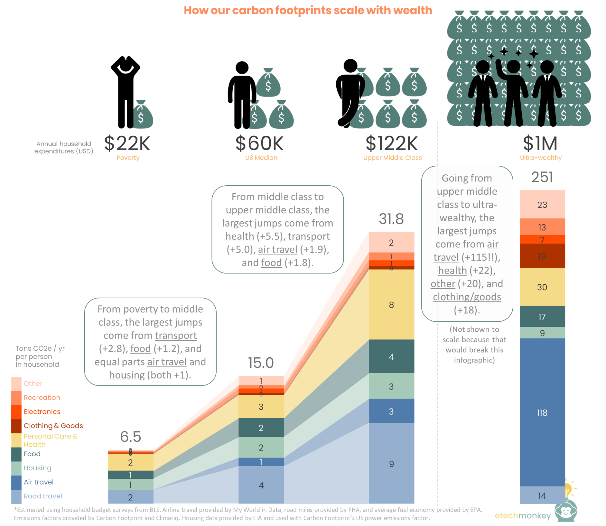
Observations:
- Different income inflection points correspond to different carbon jumps. From poverty to middle class, the largest jump came from transport, but for middle class to upper middle class, the largest jump came from health and personal care (surprisingly) and for upper middle class to ultra-wealthy, the largest jump came from air travel (unsurprisingly). This does not correspond with the largest spending jumps – for poverty to middle class and middle to upper class, the largest spending jumps come from housing, while for upper middle class to ultra-wealthy, the largest spending jump comes from other services.
As the budget expands, the impact of carbon-intensive non-essential spending grows disproportional to spending in general. For people in middle class, being able to drive and eat nicer food drives carbon footprint increases vs. people in poverty. For people in upper middle class, being able to afford nice personal care or expensive wellness items becomes a large source of carbon, but air travel, which is still a semi-luxury, remains a smaller source. For the ultra-wealthy, air travel becomes incredibly accessible and dominates the carbon footprint.
As people experience socioeconomic mobility, they need to be conscious of different non-essential carbon “spending” throughout their life. There’s no one or two categories to always pay attention to (though certain categories are more common culprits than others – transport, air travel, and health). - We already talk about “lifestyle creep”…but we should also be talking about “carbon creep.” Lifestyle creep is what occurs when increased income leads to increased spending on what were previously considered luxuries. But, as this analysis shows, “carbon creep” is a separate phenomenon. Checking lifestyle creep doesn’t coincidently check carbon creep.
Maybe understanding the relative carbon intensity of certain activities can help us make better choices with more discretionary funds available to us. In fact, one of the best things we can probably do is increase volume of purchases towards lower carbon intensity items that currently have to charge a green premium, hopefully increasing economies of scale enough to lower the price for future consumers that can’t pay the green premium. Early Tesla consumers helped do this (offset recently by supply chain issues…).
- Understanding the dollar vs. carbon trade-offs can help us make climate-forward purchasing decisions. Tracking the amount of money spent per ton of carbon can tell us how “expensive” or “cheap” our carbon is. The below shows the average dollar spent for a ton of carbon in each category:
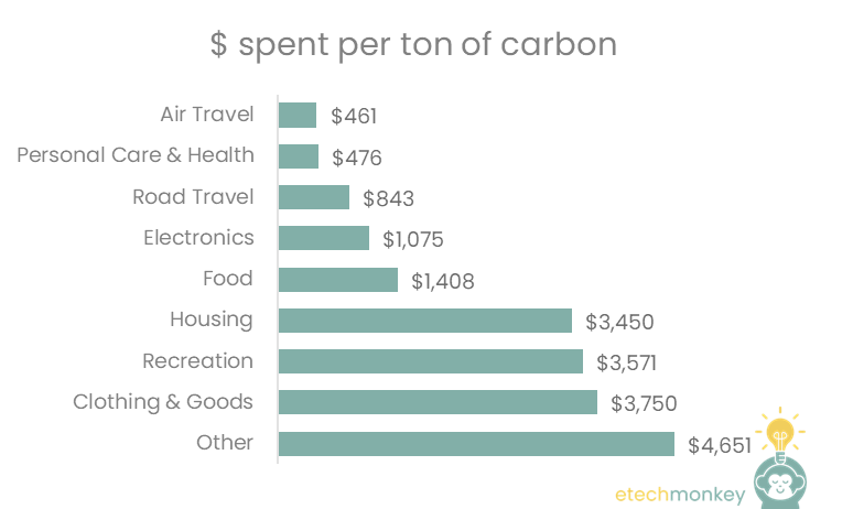
So in other words, it only takes $461 to emit a ton of carbon on air travel, while it takes more than 8x that amount to emit a ton of carbon on clothing / goods purchases. We can use these numbers to make better climate-forward purchasing decisions, like:
- Wanting to save a ton of carbon only takes a budget reduction of $476 on the personal care side, equivalent to $40 / month vs. a budget reduction of $3,450 for housing, equivalent to $288 / month
- If I want to “spend” 1 ton of carbon, that 1 ton essentially buys me $2,989 ($3,450 - $461) in additional budget if I spend it on housing vs. air travel
- If I have $5,000 to spend, I can use it on air travel, which will generate 10.8 tons of carbon, or housing, which will generate 1.5 tons of carbon. To offset this carbon, at a price of $11/ton (2030 price), I will need to spend another $119 for air travel or $16 for housing. Thus for $5,000, I have incurred a set of additional fees of $119, or 2.4% of the total, vs. $16, which is only 0.3% of the total
One side note about the last point: carbon offsets pricing does vary a lot compared to the actual $ spent per carbon emitted. The average offset right now is actually closer to $8/ton according to commodity markets, but as a consumer paying for offsets, your options vary from paying $15 - 22 / ton for services like Terrapass or Ecologi or up to $50 / ton paying for individual projects listed on marketplaces like that on Gold Standard’s website. Either way, the price paid for an offset is much less than the “price” paid to reduce carbon in one’s everyday budget, so there should be more incentive for those with the discretionary budget to do so (and the desire to be carbon neutral) to buy offsets.
Hope that was interesting and useful. I had fun with this one (especially combing through trashy articles to figure out how much celebrities spend).
Methodology
The footprint profile for each socioeconomic class was calculated at the household level (because most of the spending data available was household spending not individual spending) and the divided by 2.5 people, the average number of people in a US household.
The household footprint was split into three different sections:
- Transport – this was further divided into road travel and air travel. Thank you to FHA for contributing average car mileage, ICCT for LCA emissions factors, and EPA for average fuel economy. For air travel, I depended on Our World in Data for passenger-km, Climatiq for the emissions factor, and Carbon Footprint for the radiative forcing multiple.
- Housing – this was based on average energy use for a house provided by EIA and Carbon Footprint’s US-specific emissions factor.
- Stuff – this covers food, health, clothing & goods, electronics, recreation, and other (which includes things like childcare, insurance, banking, and education). The emissions for these categories were based on ton CO2e per dollar spent and the factors were pulled from Carbon Footprint. I assumed the US was a heavy-meat eating country (as confirmed by this table) and used the appropriate emissions factor from Carbon Footprint. The breakdown of expenses for each socioeconomic class were mostly taken from household budget surveys provided by BLS, except for that of the ultra-wealthy, in which the author used her best judgement (and some imagination) based on the sources mentioned above.
Latest beach read: the Inflation Reduction Act
12 min read
Aug 4, 2022